Moni
OVERVIEW
Communities are the building block of African culture and they’re at the heart of our day-to-day interactions with each other. So in coming up with a redesign, we asked ourselves some questions to give a sense of direction and alignment. How do we design for an African society without the cliche patterns and color, how do we design for trust or visually represent community?
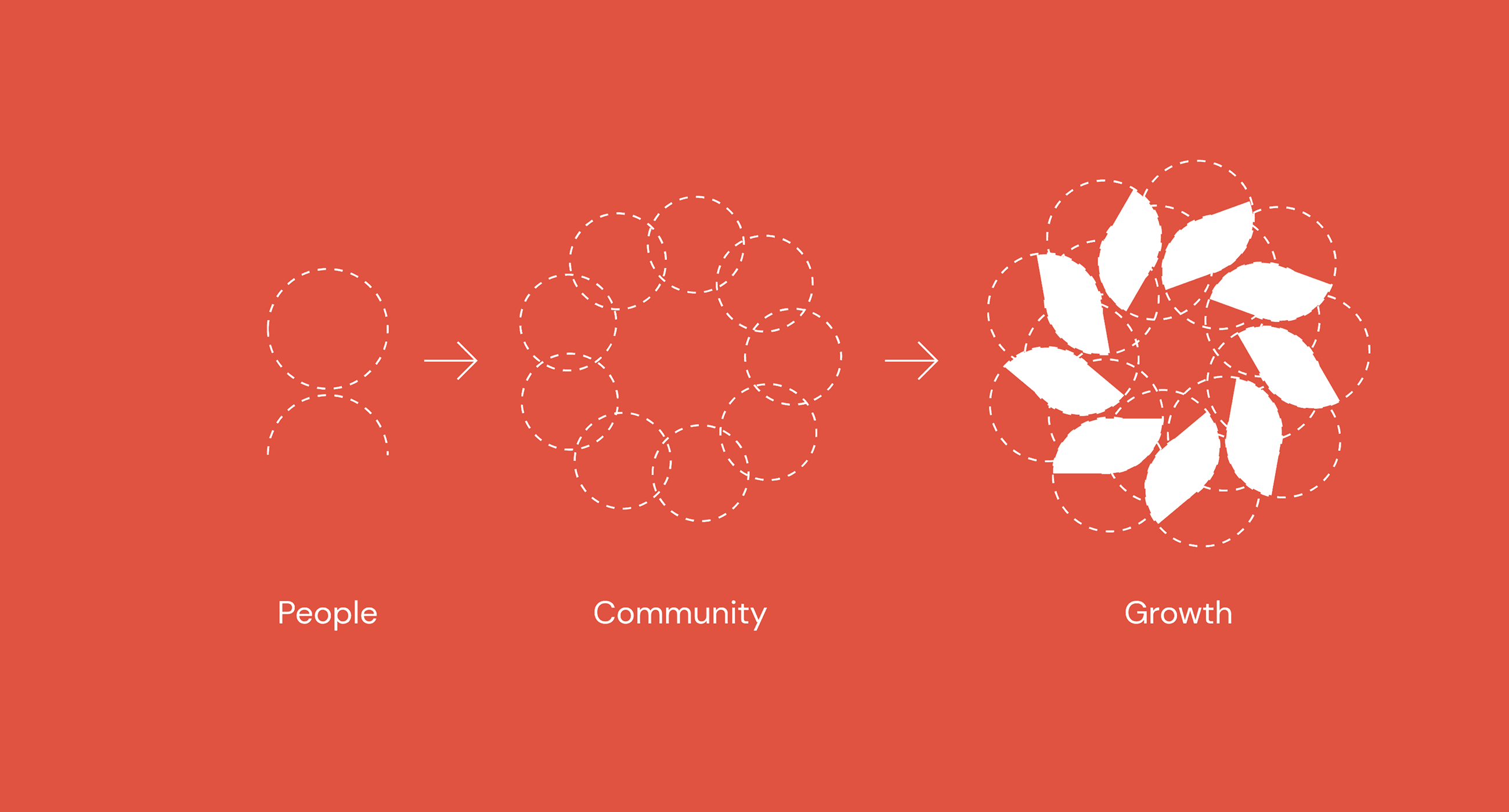
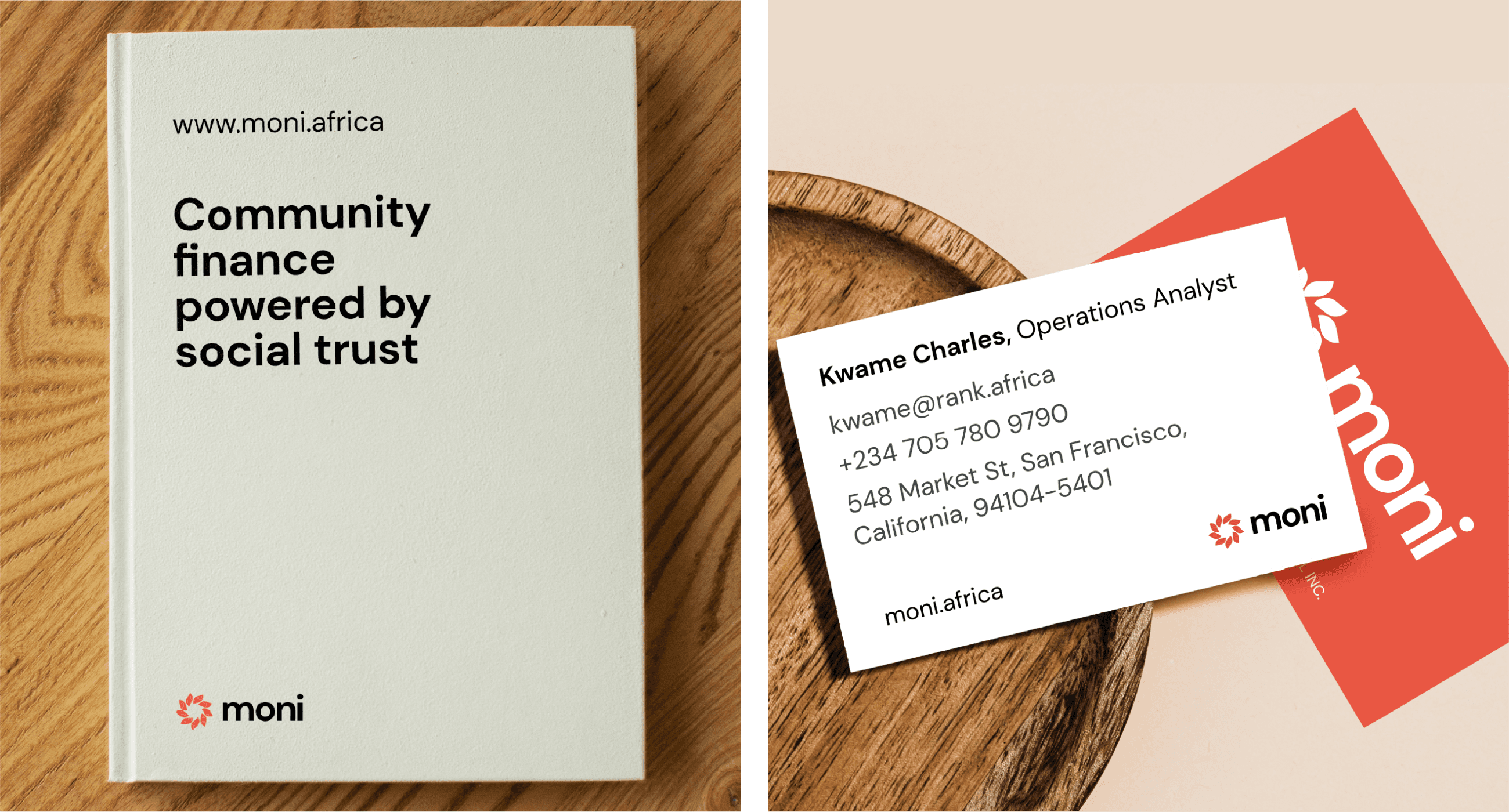
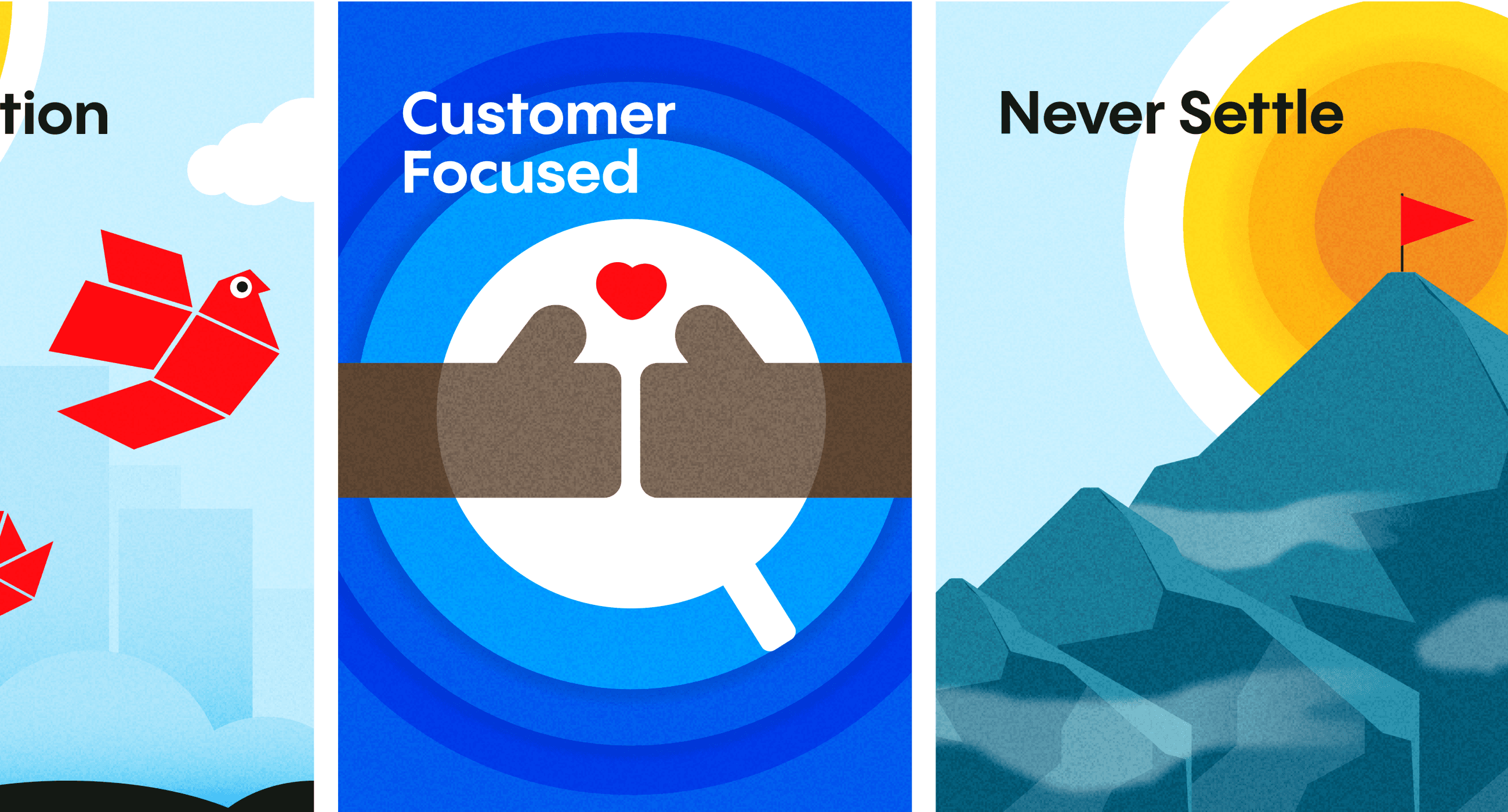
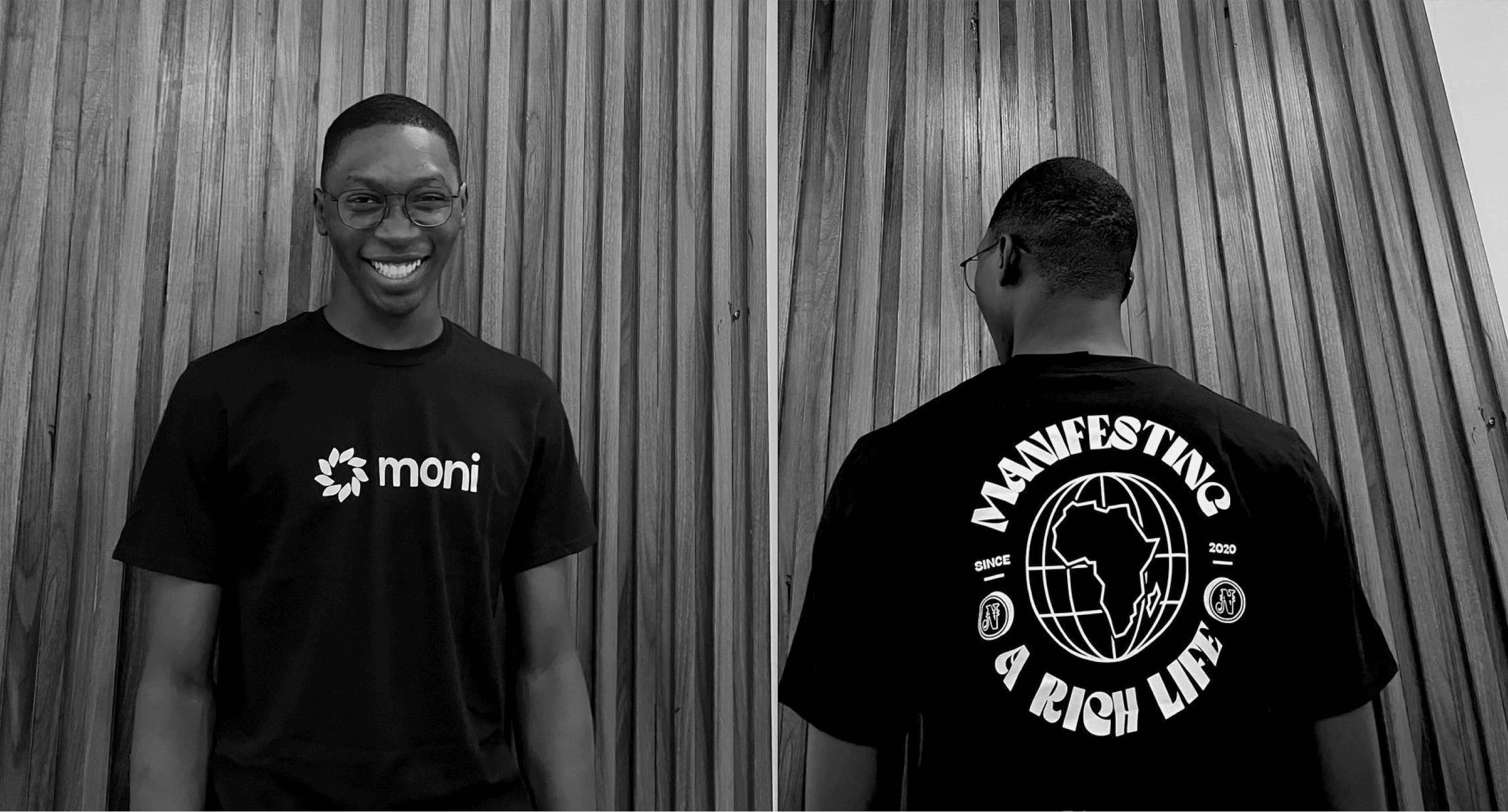
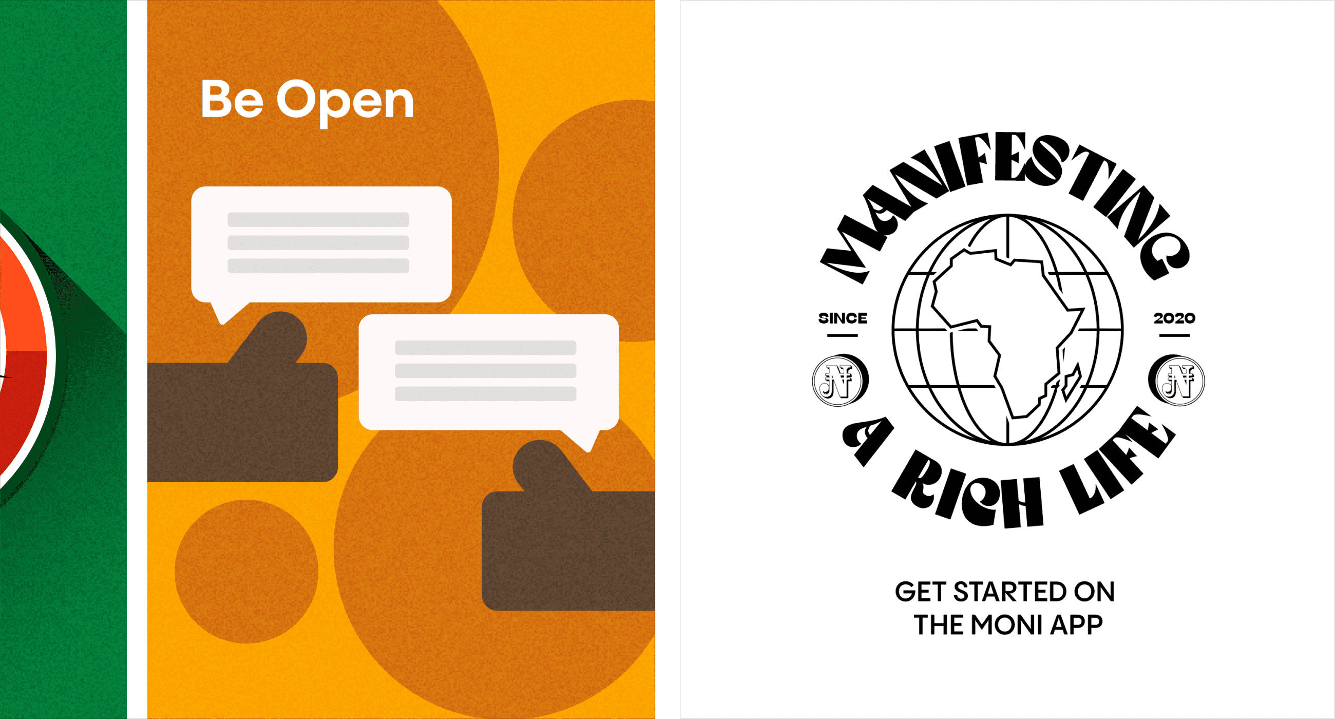
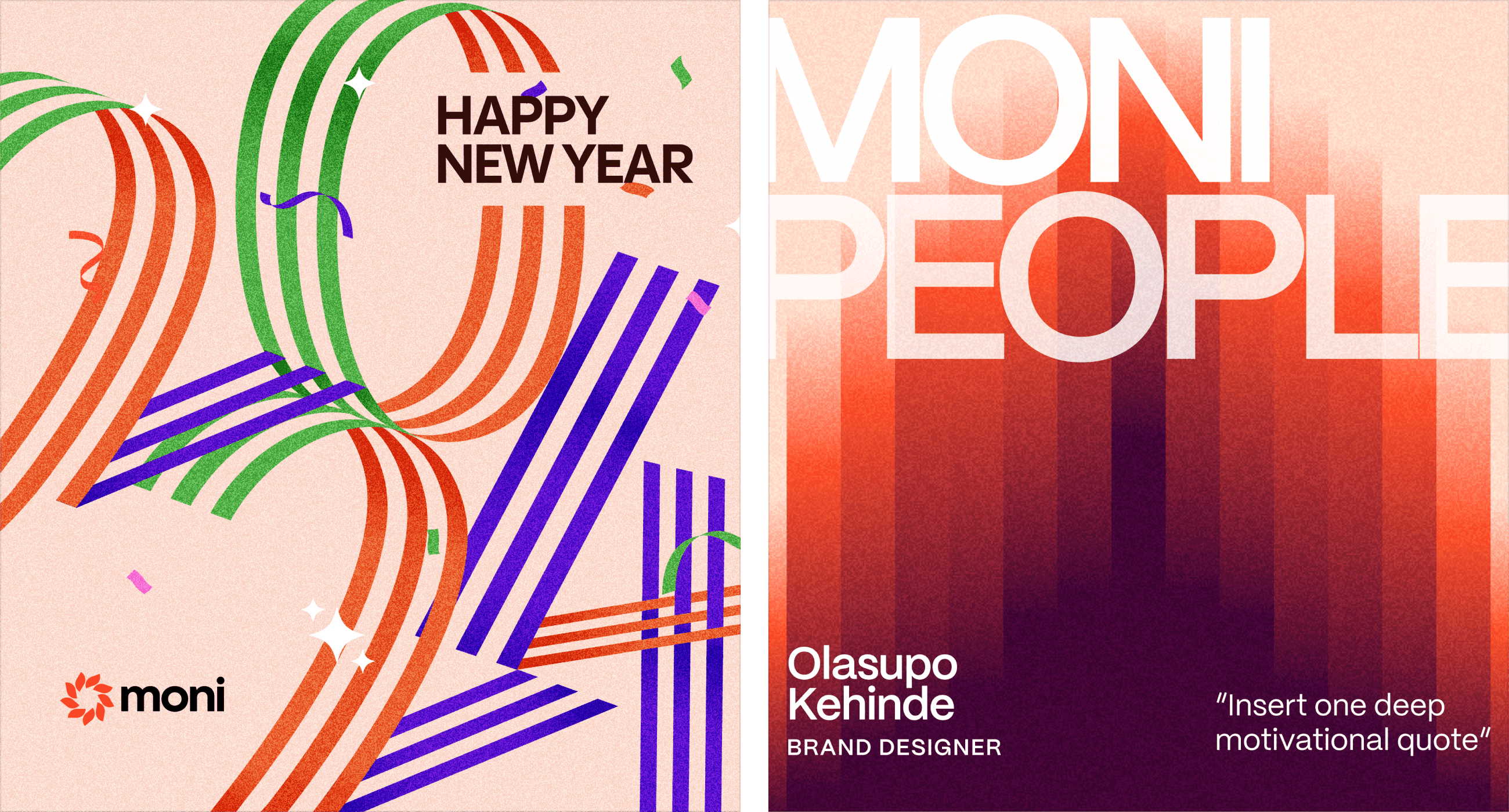
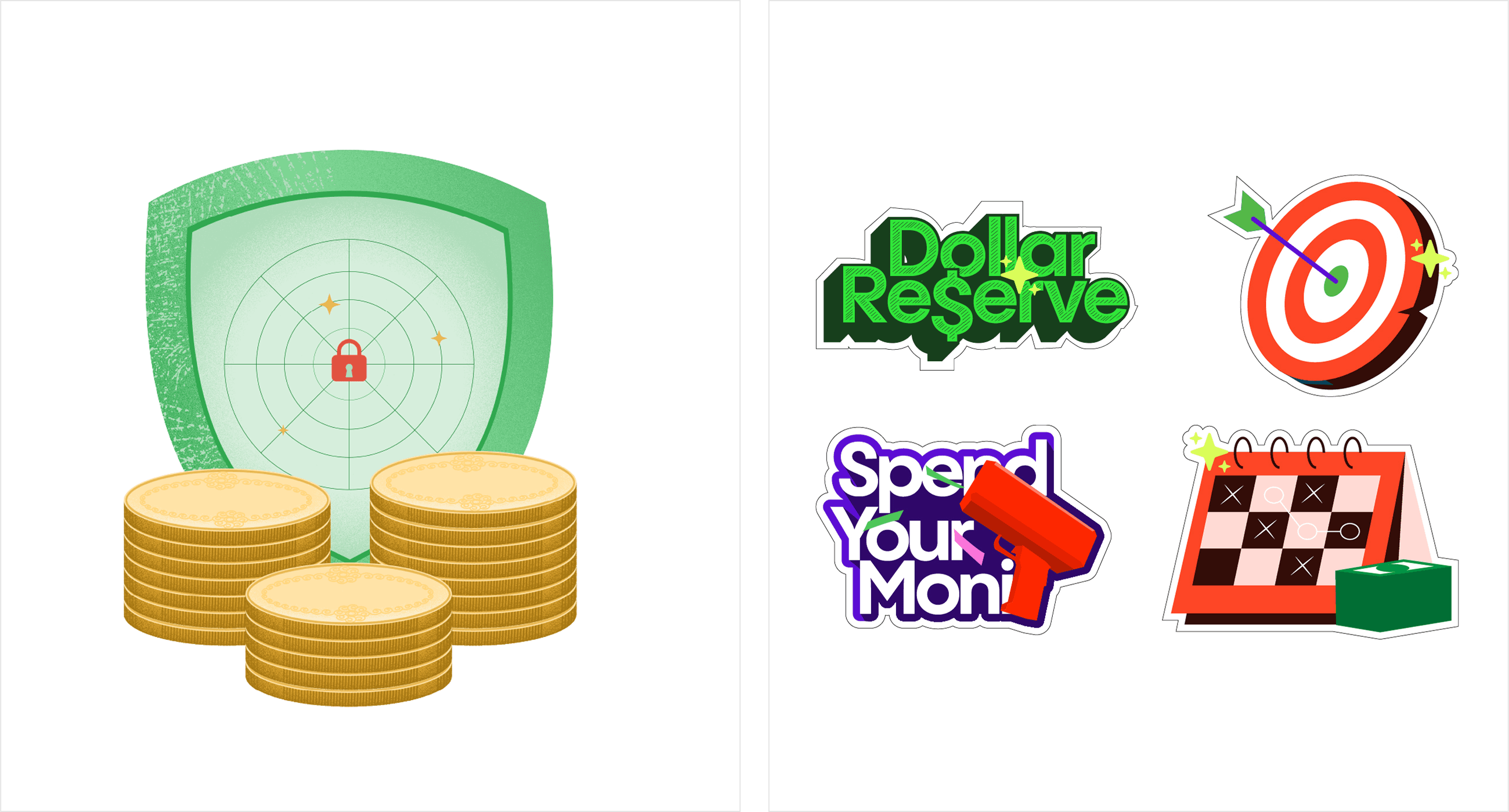
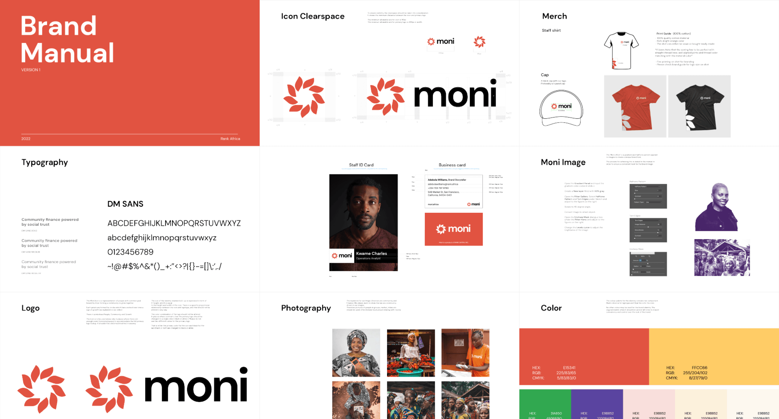
With these directions/questions in mind, we redesigned our logo to represent the people we serve. Our logo shows a community of people bounded by trust and a common goal. Circles are commonly used to represent a gathering, community and the earth therefore the logo was constructed from several circles representing PEOPLE who TRUST each other to GROW financially. The brand elements were influenced by the target audience as we want the brand to feel as local as possible. Hence the use of thick black lines and monochrome colors in the illustrations, stamps and outlined rectangles for framing pictures and text, duotones color and halftone patterns to create the moni effect on images. Finance was represented by moni coins, cash and background patterns.Overall we have been able to create a relatable brand which is flexible and trustworthy. since we implemented the new brand, we have gotten several positive feedback from our agents and inhouse staff. We also got into Y Combinator (YC W22) as a recognition of the great work we do at Moni Africa.I am also proud of this project because of the opportunity to design for the African community without the stereotype design (Patterns and bold colors, which are not neccessarily bad) we’ve been used to. I also got to work with different vendors across the country to ensure the brand guideline is been adhered to in the production of our printed materials.
Brand Identity, Packaging, Illustration, Motion, Art Direction, Print, Social Media, Merch, Pitch Deck.
Lets work together
Designed & Developed with ❤️ by me